Maps of Airbnb Reviews Reveal How Tourists Understand New Cities
Tourists pick up on all sorts of subliminal cues in just a few days.

Like many modern travelers, when data visualizer Beñat Arregi visited Athens for the first time, he stayed in an Airbnb.
There, his host gave him a local’s lowdown on the city: where to go for good food and how to get to the Acropolis, but also what parts of town to avoid.
“I was told by my host not to go [to the north side of the city] because it was dangerous or not worth seeing. So I was curious and went there,” Arregi tells Inverse. While he says it felt safe, it was distinctly rundown, with many of the stores closed down and the streets sparsely populated.
These days, Arregi is working on a project to visualize Airbnb rating data in cities around the world. He’s found that his experience in Athens seemed to play out on a statistical level, with dozens of Airbnb reviews downrating their accommodations on the north side of Athens, and more centrally-located hosts being lavished with stars. What’s more, the same pattern plays out in other cities around the world, thanks in part to the wisdom of crowds.
See also: This 20-Year-Old Designs Some of the Internet’s Best Maps
In this map of Athens, green represents 5-star Airbnb reviews. The warmer the colors, the worse the rating.
“In a way, these visualizations were not as much about Airbnb as how visitors or tourists perceive a city,” Arregi adds. “It’s interesting how someone who stays there maybe a few days gets such a good sense.”
Curiously, Airbnb users tend to be consistent in how they rate locations, suggesting they were working from fairly common preferences. Across 28 maps, in cities as varied as Hong Kong and Austin, voters from all over the world seem to agree on what’s a five-star spot and what’s not.
They could all be influenced by the perspectives of their hosts, but Arregi says it’s more likely that Airbnb users are picking up on subliminal cues from the built environment — cues that are corroborated by hard evidence.
See also: The Way to Predict Gentrification Through Social Media Data
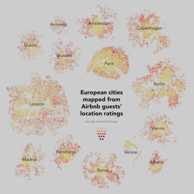
The illustration of Arregi's European data assigns a color to each individual Airbnb listing in 14 European cities. Yellow is the highest rating, while black is the worst. Red is somewhere in between.
Numerous studies have shown, for example, that satellite data can accurately predict poverty. The status of street lamps that illuminate paths at night, the variety of commercial and residential buildings, and other aspects of the built environment all subtly indicate the socioeconomic status of a neighborhood. If machine learning can crack this code, a flock of tourists can do it, too. And, as Arregi notes, the Airbnb maps roughly correspond to property values.
Rome is an example of an urban city where proximity to the urban core and its activities seem to matter more than anything else.
In Europe especially, the Aibnb data also appears to overlap with walkability scores, Arregi says. The index rates streets based on whether or not they’re designed for pedestrians, lead to a nearby center that pulls people in, and provide ample greenery and public transportation.
American cities can be more random in their score distribution. Look at difference between the maps of Rome and San Francisco. While tourists in Rome are almost categorically thrilled to be living in its dense core, tourists to the Bay Area found some less-than-lovely neighborhood even in the center of things.
San Francisco's center is preferred to outlying areas, but there are small pockets of bad reviews even in the dense core.
It’s unclear what this data will be used for, other than planning trips. But it’s possible city planners and others will be able to target improvement in the areas where tourists report feeling uncomfortable.
Regardless, cartography junkies of all stripes can play around interactive versions of all 28 of Barregi’s maps on his site.
See also: Report: AirBNB Lied About Its NYC Data