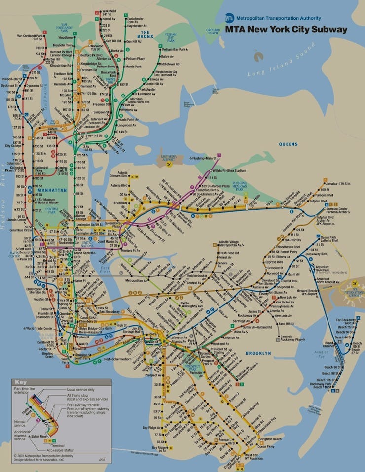
Even the most simplified subway map looks a little bonkers. But when you pass it through the funhouse mirror of reality, things get really crazy.
On Friday, Reddit user Playhouse_Animation uploaded their visualization of the true size of the New York City subway map, comparing the poster you see in every train car to the real geographic distance. The resulting visualization plumps the traditional map up like a puffer fish.
This makes sense, however, if you consider the facts: The New York City subway has 840 miles of track, which, if laid out end-to-end, could take us hurtling past Chicago. While only 700 of those miles are in use today, they’d still get us halfway to Florida. (Fun fact: The A train — one of those blue lines below — is the longest line in the city, with 30 miles of track.)
Turns out, New York isn’t actually alone with its “alternative maps.”
After this post, dozens of other Reddit users made their own visualizations comparing metro maps to real geographic distances for cities around the globe.
There’s Oslo, Norway, which is trying to rid its city center of cars by 2019 by relying on bikes and this system:

There’s also Antwerp, Belgium, which has some very uniquely shaped routes that it’s clearly struggling to wrangle into a navigable network.

And there’s Shanghai, China, which has about half the track length of New York City’s system, but services at least two times as many riders each year.
Just to name a few.
