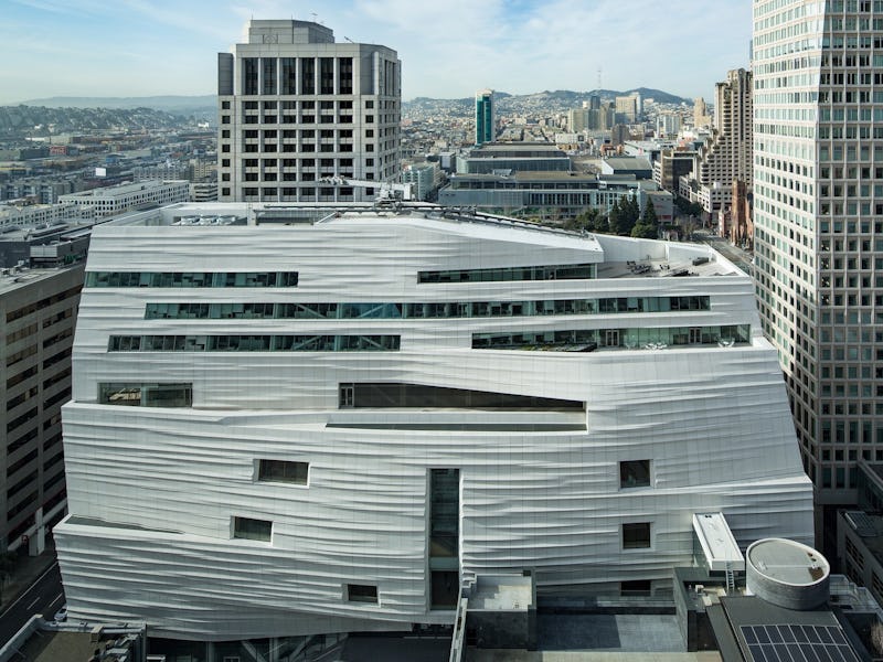
8 Ways the New SFMOMA Anticipates the Museums of the Future
The three-year project to expand SFMOMA has done much more than make it bigger.

The San Francisco Museum of Modern Art is about to open its doors to the public after an extensive, three year expansion project. Designed, or redesigned really, by architecture firm Snøhetta, the renovated SFMOMA will open with 19 special exhibitions. But it’s not really the art that people are talking about. It’s the museum itself, which is a revelation for gallerists and San Francisco civilians alike. The reimagined museum is pushing the barriers of what a museum can be and do. The building itself may set a new standard for cultural institutions around the country and even around the world.
Here are eight ways that the new SFMOMA is paving the way for museums of the future.
Size
SFMOMA now has more gallery space devoted to modern art than any other museum in the United States. The expansion includes 170,000 square feet of new indoor and outdoor gallery space, which means the building has effectively tripled in size. With that much more art on display, museum goers will get more bang for their suggested buck.
Interactivity
The SFMOMA expansion was aimed at aligning the display of contemporary art with an increasingly digital world and an increasingly digital city. The new museum puts technology — specifically interaction through mobile devices — at the center of the visiting experience. The new SFMOMA app includes a set of audio journeys through the galleries narrated by various actors, including Silicon Valley stars Martin Starr and Kumail Nanjiani, as well as audio reflections and responses to works called “Creative Responses to Creativity.”
In addition, two large story screens in SFMOMA’s free public spaces offer behind- the-scenes looks at art installation, performance rehearsals, and more glimpses into the inner workings of the new museum. Some of the new galleries feature interactive experiences with touch screens and digital tables that further the museum goers’ understanding of the art they’re interacting with. A revamped official website with a rebranded logo makes for a more user friendly and engaging online experience as well.
Helen and Charles Schwab Hall featuring Sol Lewitt’s Wall Drawing 895 Loopy Doopy
Incubation
The extensive spatial additions to the new SFMOMA provide more opportunities for both local and international artists to display their work. Since SFMOMA esteems the modern and contemporary art of its local San Francisco artists just as much as that of artists abroad, the ability to display more art inherently allows the institution to expand its palette to artists it may have previously turned down.
Snøhetta expansion of SFMOMA at night
Education
Kids won’t be bored at SFMOMA with the revamped Koret Education Center, which aims to triple the number of K-12 students it serves per year, provide more resources for professional development, and offer more hands-on arts and crafts experiences. The new museum will also offer free admission to anyone under 18 to encourage more encounters with modern art. Will it be a place for local teenagers to go on awkward dates? Yes. But it owns that.
The Campaign for Art Modern and Contemporary exhibition featuring a selection of chairs each of a single material
Accessibility
More public entrances and public spaces serve to seamlessly integrate the SFMOMA into the surrounding urban neighborhood. The ground-floor level free-to-access Roberts Family Gallery features 25-foot high glass walls that allow pedestrians to interact with the art without entering the museum.
Roberts Family Gallery featuring Richard Serra’s Sequence
Performance
Performance art has an increasingly important place in the cultural firmament and SFMOMA has sought to accommodate dynamic new works with an acoustically impressive, well lit “white box” area. The white box isn’t exactly a theater, but it definitely isn’t a gallery either. It creates a more flexible space for artists to consider.
Alexander Calder’s Untitled (1963) on view in the Evelyn and Walter Haas, Jr. Atrium at the new SFMOMA;
Sustainability
During renovations, SFMOMA’s conservation leadership team outlined ways for the museum to reduce its greenhouse gas emissions and increase its energy efficiency while continuing to display art in the most effective way possible. Taking into account the local climate and the nature of the building, SFMOMA has begun advocating for more flexible guidelines when it comes to art display protocol in order to be more environmentally friendly. The museum will also feature energy-saving LED light systems that adjust automatically to decreased daylight, building materials that minimize the transfer of thermal energy, recirculated water, repurposed construction materials, and a vertical garden in the outdoor sculpture terrace on the third floor.
Pat and Bill Wilson Sculpture Terrace featuring Alexander Calder’s sculpture Maquette for Trois Disques
Progress
At the center of all the SFMOMA’s renovations is the idea that change is integral to the healthy function of cultural institutions. This is not the prevailing attitude of the art world or the museum industrial complex, so it is — though purely conceptual — worthy of note. By holding onto some of their most prized collections while making major touch ups in other areas, SFMOMA has pursued the cultural moment without suffering the indignity of chasing the zeitgeist.
Alexander Calder Motion Lab The Fisher Collection exhibition at SFMOMA