Hands-On With Samsung’s Galaxy Z Flip 5 and Z Fold 5: Evolutionary Updates
Tech specs on a chart don’t tell you what really matters.

Looking at Samsung’s newly announced Galaxy Z Flip 5 and Z Fold 5 foldables, available on August 11, you may not see a whole lot that screams game-changing.
On paper, that’s mostly true. The two new Samsung foldable phones have a more powerful and efficient Qualcomm Snapdragon 8 Gen 2 chip, but the cameras, battery capacities, and even the software are largely unchanged from their predecessors, the Z Flip 4 and Z Fold 4.
However, tech specs aren’t everything. iPhone users know this, and Samsung seems to acknowledge it the Z Flip 5 and Z Fold 5’s safe, evolutionary updates.
The good thing about slowing down on chasing the fastest speeds and feeds is that the real-life experience does feel substantially improved — something you can’t convey on a spec chart. I had some extended time to try out the Z Flip 5 and Z Fold 5 and while not earthshaking, I’m liking the quality-of-life changes.
The Z Flip 5’s Larger Cover Screen Is More Usable
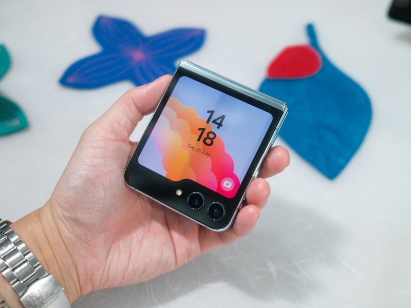
That’s the big attraction for the Z Flip 5. The cover screen (or Flex Window, as Samsung calls it) has grown from the baby one on the original Z Flip to the latest, which covers nearly the entire front of the Z Flip 5 when it’s closed.
Left to right: Z Flip, Z Flip 3, Z Flip 4, Z Flip 5. Do you know why there was no Z Flip “2” ?
The bigger cover screen on the Z Flip makes it easier to take selfies.
On the Z Flip 5, the cover screen is now an expansive 3.4 inches that lets you do way more without unfolding the device. The idea is to show you more useful information so you don’t have to open up the phone. I’m supportive of this whole movement — in whatever form device makers are trying out — to help curb our addiction to zombie scrolling.
I had hoped for full-blown Android apps to work right on the cover screen, but it appears support is limited at launch. Samsung’s updated its own cover screen apps with more expressive designs. Basic stuff like the clock, calendar, timers, stocks, and fitness tracking, all look prettier.
That being said, I did see some apps that work on the larger cover screen: YouTube, Netflix, Google Maps, and Messages. The bigger screen means there’s actually enough pixels to send a message or enter text into an app. The same goes for looking at maps — it’s still small, but if you just want directions or navigation, I could see it being handy. I’m told there’s an experimental mode that lets you force other Android apps to work with the cover screen, though there could be some formatting or compatibility issues.
Aside from the bigger Flex Window, the Z Flip 5 looks and feels pretty darn similar to the Z Flip 4. The straight sides and metal body all feel premium and the hinge feels sturdy.
You Can Feel The Z Fold 5’s Thinner and Lighter Design
At first glance, the Z Fold 5 looks like an even more mild update than the Z Flip 5, but as somebody who’s tried every iteration of the Z Fold, I can tell you that the thinner and lighter design feels more substantial than it reads on paper.
The Z Fold 5 has a completely redesigned hinge.
That’s important because even though the Z Fold 5 only sheds 2.4mm of thickness and 0.36 ounces, holding it in my hand felt less like holding a brick. For a device that you grip in one hand throughout the day and use with two hands to fold and unfold, any hand fatigue reduction compounds.
The virtually gap-free folding design should also be good for durability. Nothing’s worse than opening up a foldable phone only to see the screen covered in pocket lint.
I’ll share more detailed thoughts when I’ve got a Z Fold 5 and put it through the wringer, but right now, while I do wish there were more improvements (especially to the cameras, which are identical to the ones in the Z Fold 4), I’m also understanding that the foldable market is still relatively small compared to non-folding phones. There are still way more people with non-folding phones, and for them, everything in the Z Fold 5 is new, despite it being small steps up in the Z Fold line.
This article was originally published on