Why the Rabbit R1’s Touchscreen Can’t be Used
Rabbit’s founder and CEO Jesse Lyu explains why you can’t just poke and swipe on the R1 like you would a phone.

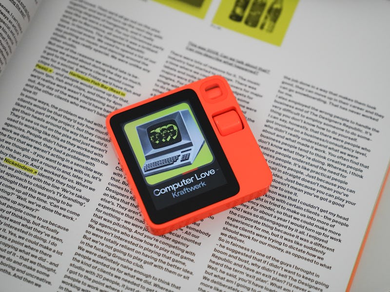
Now that you have the Rabbit R1, your first inclination might be to tap on the 2.88-inch touchscreen to use it. Yet, that’s not what Rabbit is going for with its recently released AI device.
In fact, you can only tap on part of the display when you’ve set the R1 into keyboard mode by rotating it on its side. Understandably, this design has led to some early complaints, with people suggesting that the bright orange R1 should have a fully capable touchscreen.
Interestingly, the R1’s display can be made completely touchscreen, as noted by Rabbit founder and CEO Jesse Lyu on X.
“The funny thing about [R1] is - it is a multi-touch screen and we can easily make the screen touchable on all the menus and icons, but we choose not to,” Lyu said on X, adding that you only need the push-to-talk button and scroll wheel to operate the R1. “I think the volume/brightness should be more accessible but I’m happy with operating [R1] mainly by your natural language intention input.”
That tells us that Lyu and Rabbit have made an intentional design choice here. The R1 isn’t meant to absorb all of your attention with a touchscreen. Instead, it’s designed to cut down on your screen time.
Rabbit wants most of your interactions with the R1 to be through its push-to-talk button or its scroll wheel.
Touchscreen Withdrawal
We’re not surprised at these early complaints. Almost every piece of tech people own nowadays is a full touchscreen, from smartphones to the displays in EVs.
”You go [to your phone] to waste your time or to kill your time. But you go [to the R1] to save your time,” Lyu said in an exclusive interview with Inverse’s Deputy Editor Raymond Wong.
Instead of having a touchscreen that you constantly tap away at with your thumbs, the whole point of the R1 is to only engage with it when needed — when you need the speed of the device’s AI to answer a question, control an app service, or identify stuff with its computer vision. When you do, you don’t even have to interact with the display since you primarily control the R1 with voice commands.
Looking behind the curtain a little, not making the R1 touchscreen could have also contributed to faster development times. From its initial announcement in January, the R1 is already in customers’ hands a few months later.
Rabbit clearly focused on the AI component and we can see that with how fast the R1 responds to questions, complex or otherwise. On the other hand, the R1’s interface is as straightforward as it gets. Just look at how basic the menu is. Why would you even need a touchscreen to navigate such a simple interface?
Rabbit’s interface is decidedly not meant for touchscreen use.
To Be a Smartphone or Not To Be
The question remains if incorporating a full touchscreen display was the right call or not. Rabbit can heed this early advice to cater to customer demands, which could potentially lead to more sales. This remains a serious possibility since Lyu mentions on X that Rabbit wants to collect at least a month’s worth of feedback before making any changes to the UX/UI.
If Rabbit decides to go fully touchscreen, it could be the first step towards a slippery slope. After all, if the R1 becomes exactly what the consumer wants, we might end up with another smartphone in an already crowded market.
“We never said this is gonna replace my phone,” Lyu told Inverse.
On the other hand, Rabbit could continue to make these intentional design choices that line up with its ethos. Sure, the company may lose some customers, but it could also develop a cult following for those of us not looking to give up all of our attention to another touchscreen device with distracting apps.