Nothing’s Budget-Focused Phone 2a Makes Mid-Range Look Premium
A mid-range phone with a not mid-range design.

If you had a budget-focused smartphone on your “What will Nothing do next?” bingo card, congratulations, you nailed it.
The company that brought us the Ear 1 and Ear 2 wireless earbuds as well as the Phone 1 and Phone 2 just officially took the wraps off its Phone 2a, a budget-focused phone with an interesting (and very Nothing) design that’s meant to appeal to anyone looking for a solid, sleek, phone at a non-Apple premium price.
But what exactly does Nothing bring to the mid-range phone table? Here’s a look at my first impressions of the Phone 2a before my full review.
Nothing Phone 2a Design
I was among the few U.S. journalists to get my hands on a Phone 2a since it will exclusively be available through Nothing’s developer program (read: not at a carrier or through any online or IRL retail).
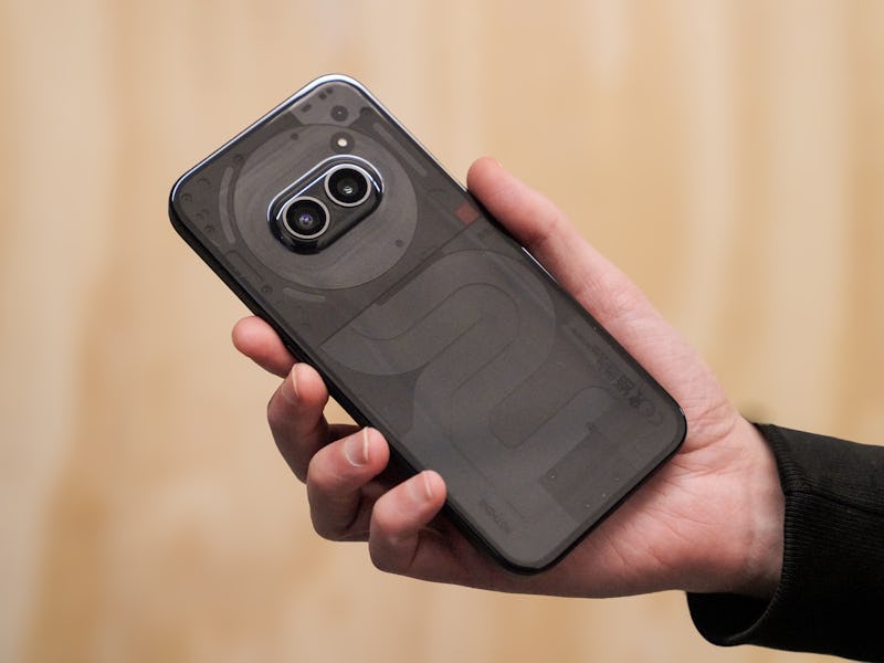
For fans of the design language Nothing has cultivated over the past few years, the Phone 2a should come as a welcome addition to its family of gadgets. Just like the Phone 1 and Phone 2, the Phone 2a has a transparent back meant to artfully showcase some of the phones’ internal components. This time, I’m told the design on the back — this curvy spiral formation — is actually meant to mimic the iconic New York City subway map drawn by Italian designer, Massimo Vignelli, in the 1970s. I don’t know about you, but I kind of love it.
I was sent the black version of the phone (which I find to be a little less flashy than the white) but can say with confidence that, even with a less contrasty colorway, the design definitely makes a statement. Plus, if you’re a fan of the Glyph Interface, you’ll be happy to know that the Phone 2a still has LEDs (only three though) on the back of the device that function the same as those on the Phone 1 and 2.
While the Phone 2a still looks like a Nothing phone, the biggest change you’ll notice is the side-by-side camera array — a 50-megapixel main and ultra-wide. The sensors are arranged next to each other to make a sort of eyes or a face even, which love it or hate it, definitely makes a statement. I haven’t gotten to do a ton of testing with the Phone 2a camera, but I’ve been pleased with the quality so far.
Most pictures I’ve taken have a more “natural” look that I actually prefer to the somewhat overprocessed quality that I get on my main device, an iPhone 13. Stay tuned for more on that in my more comprehensive review.
What Does Mid-Range Feel Like?
Probably the biggest compromise in the Phone 2a is its chip. While the Phone 2 comes with a Snapdragon 8 series, the Phone 2a ditches Qualcomm for a Mediatek Dimensity 7200 Pro. I haven’t gotten to do all the testing I need to say definitively whether the Phone 2a will meet your expectations for speed, but some brief testing (watching YouTube videos while browsing the web and other multitasking) has me pretty confident it should be fast enough for most everyday tasks.
The only real instance where I noticed lag is in the Phone 2a’s post-picture processing — sometimes, you have to wait a few seconds for a photo you’ve just taken to appear in your camera roll. This doesn’t really bother me all the much, but if you’re coming from a flagship premium device, it’s something to be aware of.
Other than that, the Phone 2a has so far felt fairly well put together. At 1,300 nits of peak brightness, the Phone 2a falls behind premium devices like the iPhone 15 (which gets about 1,600 nits), but the AMOLED display feels fast and looks smooth, and has been an overall pleasure to stare into so far. And at 6.7 inches (compared to the Phone 1’s 6.55-inch screen), the Phone 2a’s display should feel more than adequate for anyone who plans on losing themselves into a YouTube rabbit hole or watching Netflix on a plane.
Nothing Wrong With Affordable
I’m going to reserve my final judgments for a longer review of the Phone 2a, but my initial thought is that Nothing’s mid-range phone both looks and feels like a phone most people would be happy owning.
Plus, when you factor in the price of $349 (which comes with 12GB of RAM and 256GB of storage) the deal feels even sweeter. The biggest bummer, however, is that in the U.S., the Phone 2a will only be available through the developer program, meaning you can’t schlep down to your local Verizon store and pick this phone up.
If you feel compelled to sign up, follow this link. And if you want to know all the nitty gritty, stay tuned to Inverse for my more comprehensive review.