Space maps show how Covid-19 has changed your hometown
Three space agencies joined forces to create this interactive dashboard.

The impact that the novel coronavirus has had on our lives not only resonates here on Earth, but can also be observed from space.
Over the past three months, space agencies have been documenting how the global lockdown has impacted human activity and our surrounding environment.
This week, NASA, the European Space Agency (ESA) and the Japan Aerospace Exploration Agency (JAXA) released an interactive dashboard that displays the global changes in the environment, economic activity, and agriculture.
The Covid19 Earth Observation Dashboard combines multiple satellite data records with analytical tools that allow users to track changes in:
- air and water quality
- climate change
- economic activity
- agriculture
The changes can be seen in any given area around the world.
The dashboard allows you to select an area, and track the changes that have happened over the period of lockdown.
"When we began to see from space how changing patterns of human activity caused by the pandemic were having a visible impact on the planet, we knew that if we combined resources, we could bring a powerful new analytical tool to bear on this fast-moving crisis," Thomas Zurbuchen, associate administrator for NASA’s Science Mission Directorate, told reporters on Thursday.
"Together NASA, ESA, and JAXA represent a great human asset: advanced Earth-observing instruments in space that are used every day to benefit society and advance knowledge about our home planet."
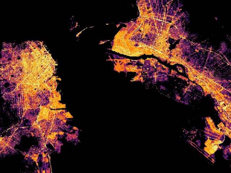
Using the different tools on the dashboard, users can look at changing shipping activity in ports, agricultural production, city lights during the nighttime, the number of parked cars, as well as data on greenhouse gas emissions during the lockdown period.
Users can look at changes on a global scale, or zoom in on a specific regional area such as New York, Los Angeles, Tokyo, Paris, Madrid, and Beijing.
The dashboard uses data from NASA's Aura and OCO-2 satellites, JAXA’s GOSAT and ALOS-2 satellites, the Sentinel missions from the European Copernicus program led by the European Commission, as well as nightlight maps using data acquired by the US Suomi NPP satellite.
The dashboard has been in the works since April when the three space agencies formed a task force of experts to develop the final product.
“Our teams are exhausted now, but also very proud to have our work presented to a global audience today,” Josef Aschbacher, director of ESA Earth Observation Programmes, said during the teleconference. "We have an obligation to offer our excellent space data to all the people on this planet."
Aschbacher added that they are currently looking into ways to expand the dashboard beyond just looking at data during the coronavirus lockdown, and perhaps making this type of data available and continue to evolve it after the global crisis.
Since the lockdown began in mid-March, the most noticeable effect on air quality could be spotted from space. NASA and ESA satellites documented a drop in nitrogen dioxide over different parts of the world such as China, Italy, and Northern India.
In April, NASA also released satellite data that revealed a dramatic reduction in levels of nitrogen dioxide over metropolitan areas of the Northeast US. The data showed that nitrogen dioxide levels in March 2020 were about 30 percent lower than they were compared to the average levels recorded from March 2015 through March 2019.
However, as some lockdown restrictions began lifting, some of these levels started climbing back up in response.
The dashboard will continue to be updated with new data from satellite observations as the threat of the pandemic still looms across different parts of the world.
This article was originally published on