The iPhone 15 Pro needs to finally fix Apple’s worst design decision
It’s time to flatten out the camera bump.

The iPhone 14 Pro and iPhone 14 Pro Max are terrific smartphones. They’re pricey glass-and-metal bricks, but as I said in my exhaustive review on Input, the 48-megapixel main camera is legit, and the “Dynamic Island” display cutout makes iOS 16 feel more alive.
But as the cycle goes, the rumor mill is already buzzing about what’s next: the iPhone 15. One analyst claims all iPhone 15 models (Pro and non-Pro) will get the Dynamic Island. Bloomberg’s Mark Gurman thinks Apple could call the beefiest model the “iPhone 15 Ultra” instead of the iPhone 15 Pro Max. One semi-accurate leaker believes the iPhone 15 Ultra will sport dual selfie cameras and USB-C will replace Lightning. These would all be welcome updates, but there’s only one design change Apple needs to make to satisfy everyone: flatten out the camera bump.
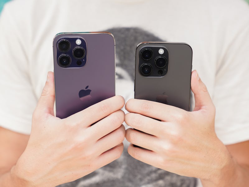
The camera bump is too big — It’s kind of outrageous just how massive the camera bump, hill, mound, platter — call it whatever you want — is on the iPhone 14 Pro and 14 Pro Max. Not only is it visibly larger, but you feel its bigness every time you pick it up. On the 6.1-inch iPhone 14 Pro, the camera bump, which houses the triple-lens camera, LiDAR scanner, flash module, and microphone, makes the device more top-heavy. I find my index finger constantly pushing up against the camera bump. It’s less obvious on the iPhone 14 Pro Max because of its larger dimensions, but the camera bump is still huge.
My index finger bumps up against the iPhone 14 Pro’s huge camera bump.
The giant camera bump also makes the iPhone 14 Pro wobble a lot on a table when you tap certain parts of the screen. Wobble, wobble, wobble.
So. Much. Wobble.
Make the iPhone backside flush — My proposal for this design compromise — former Apple design god Jony Ive once called the now-tiny-in-comparison camera bump on the iPhone 6 a “very pragmatic optimization” — is to flatten the backside and make the triple-lens camera system completely flush on the iPhone 15 Pro/Ultra.
This simple design change would make the iPhone 15 Pro/Ultra profile thicker (unless Apple can shrink internal parts), but it’d fix the desk wobble and uneven weight distribution in your hand.
An iPhone with a flush backside might not be wishful thinking. Last year, leaker Jon Prosser claimed the iPhone 14 Pro would feature a design reminiscent of the iPhone 4 with — you guessed it — a flush camera. Though that didn’t come to fruition, should Apple debut such a design for the iPhone 15 Pro/Ultra... I would pre-order in a heartbeat.
Take my money!
Two more reasons to go flat — Need more convincing? Let me offer two more reasons why Apple should flatten out the camera on the iPhone 15 Pro/Ultra. Reason one: The thickness would expand the device's volume, allowing room for new features like the long-rumored prism for a “periscope zoom” or a larger battery.
And reason two: A flat backside would have a different enough appearance, which is how many people these days make purchasing decisions for new phones, unfortunately.
Since the iPhone 6, Apple’s had the iPhone on a minimum three-year design refresh cycle.
- iPhone 6, iPhone 6S, iPhone 7, iPhone 8
- iPhone X, iPhone XS, iPhone 11
- iPhone 12, iPhone 13, iPhone 14
Tradition suggests the iPhone 15 Pro/Ultra is due for a design change. I hope it happens in September 2023.
This article was originally published on