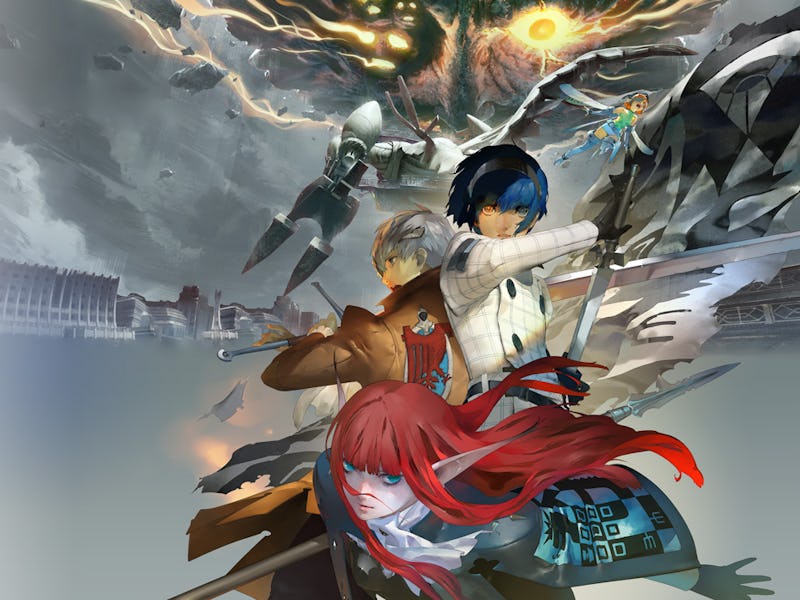
Persona 5 was a massive turning point for Atlus’ franchise, a moment that pushed a niche series into the mainstream, and even helped revitalize turn-based RPGs as a whole. That influence is clear to see as Atlus has developed four standalone spinoffs based on Persona 5. But the game’s influence permeates much deeper than that. Every release since Persona 5 has adopted the highly stylized aesthetic of the 2016 megahit, harnessing that same comic book-esque art style. Those choices have made everything from the Persona series feel too homogenized, especially when you consider that what used to make the series so fascinating was how wildly different each game felt. With the inevitable Persona 6, Atlus needs to break the trend and recapture the franchise’s wild ambition.
For some perspective, the Persona series has sold 22 million copies to date, and Persona 5 (and its enhanced 2020 version, Royal) accounts for nearly half of those sales. It doesn’t take a genius to see Sega has wanted to capitalize on fans’ rampant adoration of Persona 5, which has led to all the spinoffs. But more than that, the aesthetic and style of Persona 5 has seeped into everything Atlus continues to put out.
Persona 3, 4, and 5, all intentionally use drastically different art styles, with each one tying back into the game’s major themes. Persona 3 has a dark and grungy feel to match its heavy themes, Persona 4 injects bright colors into its quiet rural town, and Persona 5 looks sleek because it’s set in Tokyo’s booming metropolis. While there are commonalities between each game, they all intentionally use unique art styles to support their core themes, which is part of what makes each Persona entry feel so wildly unique.
With Persona 3 Reload, however, it feels like Persona 5’s shiny aesthetic was grafted onto the grim and serious bones of the original game. That creates a tonal dissonance, causing the original PS2 game arguably feeling more thematically fitting than the remake.
This is also already true with Atlus’ next game from the Persona team (also known as P-Studio). Metaphor Refantazio is a brand new game from Atlus that looks incredibly different in terms of story and gameplay, but still uses that stylized comic book aesthetic that Persona 5 crafted. I have no doubt that Metaphor will be much different from a Persona game, but you can’t deny that visually, it looks quite similar. Atlus manages to have more variety in the Shin Megani Tensei series at large, but P-Studio needs to shake things up.
The graphical update works for parts of Persona 3, but Reload also makes the game lose some of its thematic edge with its visuals.
It almost seems like Atlus has been afraid to deviate too far from Persona 5, not wanting to alienate the millions of new players that jumped on board with that entry. Using a recognizable art style certainly helps new games appeal to players who have only touched Persona 5, but I’m worried that it won’t let Persona 6 be as ambitious as past entries.
Persona 5 was a success because of the risks it took, and the way it built on the foundations of the last few games and polished their systems to a high sheen. That experimentation and ambition it quintessential to what’s made Persona so special, with each game finding its own unique visual identity.
Luckily, a recent update from renowned leaker Midori gives us a glimpse of a temporary logo for the sequel, which also hints the game’s color scheme will be green. Each Persona game has a core color that ties into its major theme, blue for P3, yellow for P4, and red for P5. Continuing that color theme is a good indication that Persona 6 is carrying on the series’ traditions.
For eight years now we’ve been stuck in a Persona 5 prison, with the influence of that game being felt in literally everything Atlus has done. It’s time to move on.