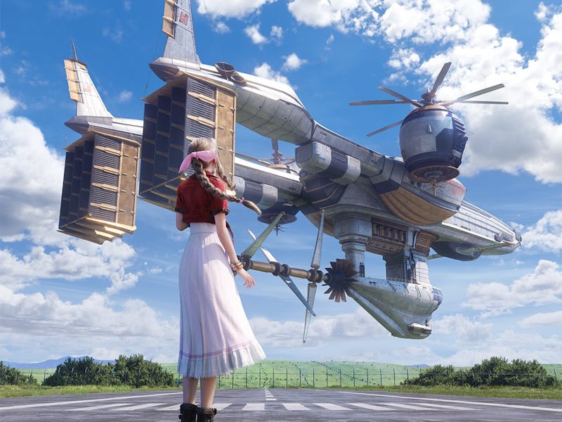
Epic New Final Fantasy 7 Rebirth Art Reveals the Biggest Pitfall of Video Game Remakes
New high-def art can’t capture the original’s low-poly heart.

Recreating the world of Final Fantasy 7 in a higher fidelity, more realistic style is one of the biggest promises of Final Fantasy 7 Rebirth. It’s also the most boring one.
Don’t get me wrong — seeing Midgar come to life in Final Fantasy 7 Remake was a thrill, and I’m looking forward to seeing the rest of Gaia rendered with the same depth in Rebirth. Being able to see the game’s characters as real people, rather than one step up from Lego minifigs, is a particularly important upgrade, giving another emotional dimension to their stories.
But I can’t help but feel that something is also lost in the process. Last week, Square Enix shared a new image from Final Fantasy 7 Rebirth on the website formerly known as Twitter. The admittedly gorgeous render shows Aerith standing in front of the party’s airship, the Highwind, recreating a famous piece of key art released before the original Final Fantasy 7. Fans immediately started posting the original image in response, mostly noting how much better the new version looks.
For me, though, seeing the two side by side just drives home the problem of making photorealism the paramount goal of video game art. Yes, it’s cool to see so many more details on the body of the Highwind. Yes, it’s an impressive image from a technical standpoint. Yes, I absolutely want to steal Aerith’s look.
I don’t think about any of those things when I look at the original art. It looks much rougher today, with Aerith practically looking like she’s made out of clay and the Highwind rendered in an entirely different style in the background. The original is muted compared to the sleek update, and not just because a greenish tint over the image has been stripped away for its dazzlingly clear recreation.
You may not like it, but this is what peak video game art looks like.
The original Final Fantasy 7 key art reminds me of an old, faded photograph pressed into the pages of a book somewhere. It feels like the outset of an adventure, a moment in time laden with history that lies just outside the frame. I look at that image and can’t stop myself from imagining the journey that it’s set within, tinged with a sense of nostalgia.
The Final Fantasy 7 Rebirth version, on the other hand, feels more like an Instagram post. It’s glossy and well-lit, with better composition than the original. I see it and think, “This looks like such a nice day for this girl with great boots.”
None of this is meant to disparage the art itself or the game it’s promoting. There are plenty of reasons beyond quality that the original hits me harder than the replica, not least of which that I was a child with an overactive imagination when I saw the original, and now I’m a grumpy lady in her 30s. The image feels nostalgic now because that’s how Final Fantasy 7 feels.
But beyond that, Final Fantasy 7 Remake is a game about how stories are altered by their retellings, and Rebirth looks like it will continue that trend. I’m not saying Square Enix intended for this new piece of art to make me feel the way it has, but the uncanniness of the update does fit nicely within the story of the remake trilogy.
Final Fantasy 7 is a game shaped by the loss of Aerith. She exits the narrative well before the party boards the Highwind, despite her saying she wants to take a ride in the fancy ship when she first catches sight of it. It’s still not clear how much Aerith’s fate will be changed in Final Fantasy 7 Rebirth, but it’s possible that her role in the story will be transformed in the same way she has in this new key art — no longer a figure in a hazy memory, but a woman staring into her future against a bright blue sky.