Teenage Mutant Ninja Turtles: Mutant Mayhem Is Just the Latest in a Radical Animation Renaissance
After years of stagnation, artists can finally get a little weird.

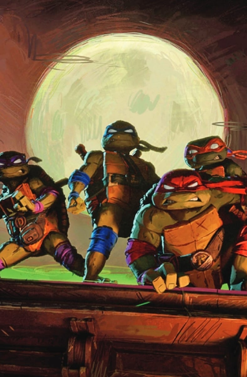
To create one of the year's most critically acclaimed animated movies, production designer Yashar Kassai and his team of artists had to “unlearn everything we learned in art school, and frankly, draw shittier. Like a kid who’s 14 or 15.”
Kassai worked as production designer on Teenage Mutant Ninja Turtles: Mutant Mayhem, the latest in a new wave of animated movies with distinct art styles and broader audiences — and it couldn’t come at a better time.
With Pixar slumping, Disney obsessed with live-action remakes and the Minions running rampant, American animation has seemingly been on the decline for years (at least when it comes to big-budget studios). A 2017 Film School Rejects article titled “The ‘Dreamworks Face’ Must Be Stopped” summed up the problem: the studio’s ubiquitous smirking characters warned adult viewers that while their children might be pacified for 90 minutes, they would be bored stiff.
Boss Baby must be stopped.
That changed in 2018 when Spider-Man: Into the Spider-Verse rewrote audience expectations for animation. Not only was it a fun, colorful, and poignant movie for kids, but it also appealed to adults with a thrilling take on Spider-Man and clever multiversal story miles ahead of Marvel and DC’s live-action attempts.
Most importantly, it dared to develop new, hyper-stylized animation techniques that set it apart from the photorealistic 3D style Pixar and Dreamworks had popularized. Since then, movies like Puss in Boots: The Last Wish and The Mitchells vs. The Machines succeeded by experimenting with stylized 3D textures.
Teenage Mutant Ninja Turtles: Mutant Mayhem represents the next evolution of this movement, but it’s also a full-circle movement as the same techniques are applied to reimagine another classic superhero franchise. Here’s how we reached this pivotal moment in animation, and how everyone’s favorite crime-fighting reptiles are taking it one step further.
Into the Spider-Verse ignored the hyper-realism of Pixar for an animation style that emphasized its comic book origins.
Audiences flocked to those movies, as well as a Spider-Verse sequel. While franchise branding certainly contributed to some of these successes, their inventive visuals delivered spectacle on par with live-action blockbusters, which ushered in a new era for animated films.
“Spider-Verse proved you don’t have to play it safe to be successful,” Mutant Mayhem director Jeff Rowe tells Inverse. “The marketplace wants things that are unique and different and that movie made it possible for everyone else out there to say ‘I want to make this look visually different.’”
Rowe has felt the impact of Into the Spider-Verse’s success. He co-directed The Mitchells vs. the Machines, which shared an animation team and reused much of Spider-Verse’s technology. Now, the success of both films is allowing Mutant Mayhem to further experiment with its visuals.
There’s a roughness to the animation in Mutant Mayhem that would never fly in a Disney movie.
The popularity of Spider-Verse — and the scope of its massive multiversal sandbox — also led to the upcoming short “The Spider Within,” which tells a thriller-inspired story with darker themes.
Its writer, Khaila Amazan, took inspiration from how Into the Spider-Verse combines visual styles, and how anime constantly combines genres to tell new stories. “Looking at different points of reference from anime to horror allowed us to not stick within the rigidity of what American animation was in the eyes of audiences,” Amazan tells Inverse.
Now, Mutant Mayhem is looking to reinvent the half-shelled heroes in the same way Spider-Verse revitalized Mile Morales. While a parade of cartoons, comics, and live-action movies prevented TMNT from ever leaving our screens, Mutant Mayhem is using innovative new animation to reframe the characters. For one thing, it’s actually focusing on them being teenagers.
“That was our number one goal,” Rowe says. “We recorded [the teenage cast] in a way where they talk over each other and it feels improvisational.”
The turtles were also given distinct looks that speak to their immaturity. “They needed to feel like real teenagers who are awkward and lanky or big, like they haven’t grown into their bodies yet. They’re still figuring it out and they have bad posture.”
For once, the teenage turtles actually look like teenagers.
The result is a brand new intro to a nearly 40-year-old franchise. The movie can appeal to kids with eye-popping visuals and relatable characters, while also delivering a dose of clever nostalgia for older viewers.
“We ride this fine line between stupid and good,” Kassai says. “We try not to take ourselves or the characters we design too seriously, but instead infused every aspect of the movie with teenage energy.” This wasn’t easy; trying to draw like teenagers meant drawing like someone “in their first art class ever, or who’s doodling in the corner of your notebook.”
To Kassi, Spider-Verse proved that experimental aesthetics are commercially viable, and now movies like Mutant Mayhem are revolutionizing the entire animation artform.
“[Spider-Verse] showed there does not need to be a separation between the quality and the aesthetics,” Kassi says. “So we can just be super ambitious with the look of a film.”
Teenage Mutant Ninja Turtles: Mutant Mayhem is in theaters now.
This article was originally published on