There’s No Excuse For the Worst Part of The Flash
Andy Muschietti, stop your excuses.

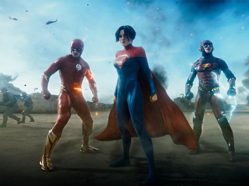
The Flash’s VFX doesn’t look good. That’s the prevailing sentiment around the new DCEU movie, even from its fans. The special effects look unfinished at best and like wax-museum-replicas-meet-Polar Express-hybrids at worst. And it all culminates in an uncanny cameo bonanza in the third act that has been rightfully raked across the coals online.
But according to The Flash director Andy Muschietti, that’s how it’s supposed to look. The bad VFX is not a result of an unfinished product rushed to release, but a feature. And it’s all made clear in the first (quite bizarre) action sequence.
Spoilers for The Flash follow.
Near the start of The Flash, Barry Allen is tasked with evacuating a crumbling hospital in Gotham City. He uses his powers to save people from the falling rubble, but then the worst happens: the foundations collapse, causing an entire floor of newborn babies to come shooting out the window alongside a screaming nurse. The whole scene freezes and starts to move in slow-mo, with Barry hopping along at normal speed, throwing a burrito in a falling microwave to boost his fading energy, then using a gurney (and the microwave) to rescue the falling babies. Unfortunately, it all looks a little... off.
io9 asked Andy Muschietti and producer Barbara Muschietti about this sequence, and Andy Muschietti revealed why the babies looked like they were ripped out of an early 2000s video game.
“The idea, of course, is...we are in the perspective of the Flash,” he says. “Everything is distorted in terms of lights and textures. We enter this ‘waterworld’ which is basically being in Barry’s POV. It was part of the design so if it looks a little weird to you that was intended.”
To Muschietti’s credit, the VFX for the rest of the movie looks just as distorted and bizarre. But his excuses still fall flat when you remember what has already been accomplished with speedster sequences in previous superhero movies.
Speedster Movies Can Look Good
The concept of speedster superheroes moving at regular speed while the rest of the world slows down around them is nothing new, but it was given a new lease on life with X-Men: Days of Future Past. The 2014 movie introduced Evan Peters’ Quicksilver, a mutant with a superspeed ability. But it was the sequence where he shows off his powers for the first time that arguably set a new blueprint for how these sequences could be done.
In Days of Future Past, time slows to a snail’s pace. Every character and object ostensibly freezing in place, but Quicksilver casually straps on his goggles and gets to work, casually moving through the chaos of bullets flying and food spilling, to the tune of Jim Croce’s “Time in a Bottle.” It’s one of the coolest, most visually creative cinematic depictions of accelerated time ever, so much so that Zack Snyder would borrow from it for his portrayal of Ezra Miller’s Flash — only in Snyder’s Justice League, the slow-mo speedster sequence was accompanied by flashes of lightning and muted screams.
The Flash entering the Speed Force in Justice League
But even so, the Days of Future Past Quicksilver scene and Snyder’s own previous depictions of The Flash in the Speed Force show that these speedster sequences don’t have to look bad. Maybe Muschetti didn’t need to borrow from Snyder’s grayscale aesthetics for The Flash, but he could have at least looked to what has already been done before — and been done without the use of uncanny CGI monstrosities.