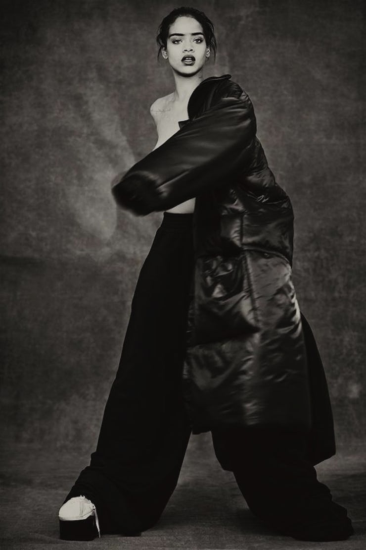
Bad Omens at Rihanna's 'ANTI' Art Unveiling
A worryingly ostentatious display from pop's most controversial diva.

My theory is: people imitating Kanye the elder is always bad. The grandiosity of his PR and his most high-faluting artistic pretentions — he finds a way to make them transcendent and mythical, from premiering his videos by projecting them on buildings to unleashing anti-fashion fashion lines to making the most unlikely videos elegant.
Travi$ Scott’s Rodeo was a good musical example of When Post-Kanye Goes Wrong, for the age of Yeezus — he played Kid Cudi to Yeezus’ 808s and Heartbreak and unleashed a bloated and pretentious psuedo-trap opus. But yesterday, with the unveiling of the album art and official announcement of her long-awaited new album (executive produced by Kanye) at the Mama Gallery in LA, $cott’s current flame Rihanna embraced ‘Ye-esque grandiosity herself.
And it was certainly ridiculous, mostly because of the art itself, which is below. It’s the work of artist Roy Nachum, the better part of whose work focuses on the theme of blindness, as does the painting for Rih.
Nachum’s website showcases his pieces in a section called “Artworks”; a biographical section guides us through his themes and all the citations he may or may not be making in his paintings. His work has “the brooding intensity of either German Expressionism or Classic Rock posters.” He “limits his palette to a few colors in an almost subconscious nod to the power of Japanese woodcuts.”
I wonder what he’s almost subconsciously going for with this one. Deftones CD pamphlet art, with some paint spilled. It also kind of reminds me of that one Train album cover.
Nachum’s art isn’t all bad, and I accept the intention of the statement — the use of braille on the surface of his paintings to provide a new way of interacting with art. There’s an interesting idea there. Will Rihanna’s CDs have braille on them? Hm. Let’s do the math and figure out cost of production on that.
It might not be so bad if Rihanna hadn’t been claiming to be “changing the history of album art” with this Nachum joint. This was inscribed on the wall of the Los Angeles gallery where Rihanna held the event:
Yes, the name of the album is ANTI, not R8, as fans have affectionately dubbed it.
As all this wasn’t enough, Nachum and Rih had people “interacting” with another white painting in the gallery, covered in braille. They put blindfolds on and were told to scribble whatever they wanted on it with a black crayon:
Shades of Jay’s performance art at the Pace Gallery last year here. Rihanna’s got something new and special to say, it’s clear. But it’s a shame we know so little about the music (no new songs were played at the gallery), and a bit worrying. Will it bear the stamp of now-boyfriend $cott, who was behind Rihanna’s biggest recent single, “Bitch Better Have Money”? Or Kanye (the unsatisfactory “FourFiveSeconds”?)
What does Rih have to say? To MTV in the winter: “I’ve made a lot of songs that are just really, really big.” Big like this art unveiling? Big like big, vague, expensive, dilettante-y big? Or great music? It remains to be seen. Rihanna seems a bit mad at her old stuff, but the rest of the world isn’t. Change is good, but if this painting is a microcosm of what’s to come, it’s reason for concern.