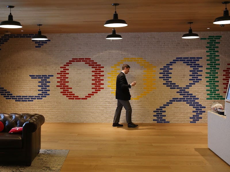
Google Has a New Logo and It's the Biggest News in History
Somebody there is a sans serif fan.

Stop the presses! Google just announced … something.
On the heels of stripping down and mixing itself up by announcing its new umbrella company called Alphabet last month, Google is giving itself a bit of a makeover.
Just like the spiffy video says, a lot has changed at Google since it first began as a modest search engine 17 years ago. From launching Gmail, to trying to digitize books, to making sure no one ever gets lost with Google Maps, to getting in the browser game with Chrome, Google has branched out into making the modern world a bit easier to navigate.
And now comes the biggest change yet, at least according to what a new post on its official Blogspot page makes it seem to be. We’re not sure about what else is changing other than the Google logo, which is the first time it’s been redesigned since 2013. Looks like Sundar Pichai is a sans serif fan.
They’re also adding some kind of Suri-like microphone to do all your Googling for you hands-free.
We like the pomp and circumstance, but as of right now it’s just a bunch of buzzword nonsense. Take this gem of corporate eye-roll-inducing marketing jargon:
Today we’re introducing a new logo and identity family that reflects this reality and shows you when the Google magic is working for you, even on the tiniest screens. As you’ll see, we’ve taken the Google logo and branding, which were originally built for a single desktop browser page, and updated them for a world of seamless computing across an endless number of devices and different kinds of inputs (such as tap, type and talk).
Brands! Content! Synergy! Why is it news that a gigantic multi-billion dollar company changes its logo? What’s the point anymore? Why am I writing this right now? I’m gonna do a Google search to find out.