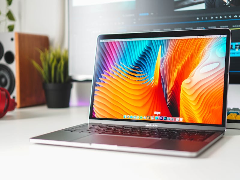
Macbook Pro: Apple's Latest Laptop Shakeup Foists a Hated Feature on Users
Oh dear.

Apple’s latest MacBook shakeup has left tech fans all shook up. While the company did announce some needed updates to the Mac line Tuesday, at least one facet of the launch is already ruffling feathers.
First, the good: The 13-inch MacBook Air now starts at $100 less at $1,099, and comes with the high-end “True Tone” display technology that alters the colors to better match surroundings. The 12-inch MacBook, which sat at a rather curious midpoint of the product lineup, has been discontinued. The entry-level 13-inch MacBook Pro now uses the latest eighth-generation Intel processors, the T2 security chip and the “True Tone” display. That’s all great.
But one change won’t be well-received. All MacBook Pros now use the Touch Bar, a touch-sensitive strip of screen that replaces the function keys on selected laptops. Originally introduced in October 2016 for high-end MacBook Pros, the controversial feature now comes with every professional Mac laptop with no option to refuse. Users that want to avoid it now have to choose the MacBook Air.
“Apple is truly doubling down on stupid,” declared a representative MacRumors comment from a user called “Pepe4life.”
The feature was touted at launch as a versatile set of options that adapts to the current app. It could show volume controls in Spotify, web shortcuts in Safari, or emoji when writing an email. In other words, it was sold as an upgrade.
But even nearly 3 years after launch, judging by the mood Tuesday, that’s not how it’s been received in the community.
The Touch Bar: all it's cracked up to be?
MacBook Pro Touch Bar: Why the Feature is So Controversial
It’s fair to say the bar is controversial. One MacRumors post with over 50 “likes” dismissed the feature as a “useless gimmick,” a poor replacement for keyboard shortcuts, on-screen buttons and trackpad gestures.
“There are times when the Touch Bar is actively counterproductive,” wrote 9to5Mac’s Ben Lovejoy in October 2018. The site’s owner, Seth Weintraub, is quoted in the story with even stronger words: “If I counted all of the false Siris and back buttons, I’ve probably lost a day of my life.”
It certainly seemed cool at first, a button row that could display anything! But programmers in particular missed the physical “escape” key, fast typers hated having to look down more to find a certain button, and regular users found the strange hidden functions baffling.
“There’s rarely much use for it,” Matthew Smith wrote in his DigitalTrends review. “At best, it provides a quick way to scroll through lists, such as your Photo Stream. It can also be useful if you’d like to scroll through a video – and it’s great at picking up on such content, activating a scroll bar even when browsing YouTube. In other cases, though, it’s clearly a solution searching for a problem.”
As lead designer Jony Ive announces his departure from Apple, one of his most controversial designs could end up as one of his last.
MacBook touch bar.
MacBook Pro Touch Bar: Why Apple Even Makes a Touch Bar
Although it pioneered the multi-touch display, Apple has a complicated relationship with touch screens. It seems bizarre now, but the iPad disappointed some fans at its unveiling because it used a tweaked version of the iPhone’s operating system instead of the more capable Mac operating system. Apple has steadfastly refused to add a touch screen to a Mac.
The rationale is that the Mac and its operating system are designed for a mouse. Fitts’ Law suggests that the fastest parts of a screen for a user to access are the corners and edges, for example, as you flick the mouse in that direction with no need to slow down. The Mac’s menu bar and dock took advantage of Fitts’ law, offering tiny buttons that would be tough to touch but are easy for a mouse to click. The computer’s design, Apple reasoned, is not good for touch.
“Can you imagine a 27-inch iMac where you have to reach over the air to try to touch and do things?” vice president Phil Schiller asked in 2016. “That becomes absurd.”
Enter the MacBook Pro’s Touch Bar. The small strip would bring some of the benefits of a touch screen to a decidedly un-touchable machine. App makers could configure new buttons, just like they could on the iPhone, while users wouldn’t need to hold their arms out to interact with the screen.
Although Apple doubled down on the bizarre bar on Tuesday, there are signs that it’s something of a stop-gap solution. Soon after the feature’s 2016 launch, designer Jony Ive gave an interview declined to answer questions about the touchscreen, saying “that puts me starting to talk about things that we are working on.” In the same interview, he described experiments with touchscreen trackpads, and described the bar as a “beginning.”
Apple has since filed patents for dual-screen MacBooks and key-free keyboards, like the one captured on this Furkan Kasap concept:
The bar may be here to stay for now, but it may be a stopgap to something more ambitious.