Samsung Galaxy S9 Makes a Bold Decision in an iPhone X-Obsessed World
The smartphone stands out, but for an odd reason.

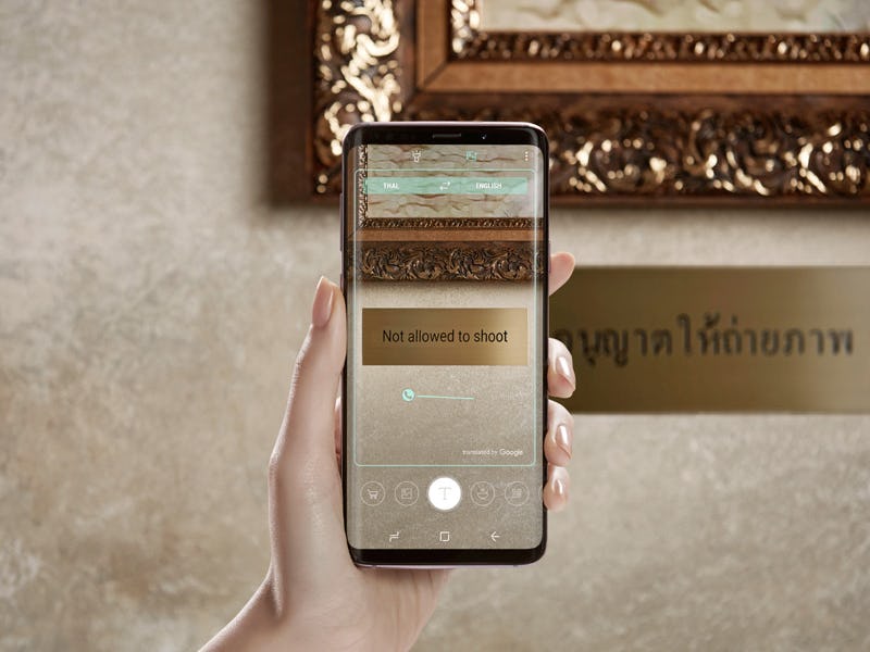
Samsung’s latest flagship smartphone launched on Friday, and it took a big stand in the process. As the rest of the industry looks to Apple’s $999 iPhone X as a model to emulate, the Galaxy S9 packs a tried-and-true display style that avoids trendy “notches” in favor of a traditional square screen.
The S9 packs impressive specs at the high-end of the market. A Qualcomm Snapdragon 845 processor is offering 25 percent faster processing speeds, alongside 4GB RAM, a 3,000mAh battery, a USB-C port, a 5.8-inch display, and a headphone jack. The standard model retails for $720, while the S9+ weighs in at $840. While the specs are boosted, on the outside you could be forgiven for thinking it looks the same as the S8.
The S9 is a square phone in a sea of screens shaped like Bert from Sesame Street. The Android-based Essential Phone that launched in August 2017 was the first major phone to use the design, but the iPhone X launch in November 2017 brought the choice to a wider audience — a design Apple claims was necessitated by the Microsoft Kinect-like sensor used for face recognition. This started a trend, with the Asus ZenFone 5, OnePlus 6 and Leagoo S9 all employing the feature. Google’s Android P release is also set to build in operating system-level support later this year.
There’s already signs that the “notch” is a passing fad, though. iPhone X owners on Reddit claim they don’t even notice the design after a while, and Apple is rumored to be changing course when it launches three new iPhones this fall. LG is hedging its bets with an optional notch controlled by software.
“After Just 6 Months, the Phone Notch Is Already Deeply Uncool,” Gizmodo declared in an editorial, which noted that while the ZenFone 5 offers an impressive screen-to-body ratio of 90 percent (compared to the S9’s 83.6 percent), utility kilts and minivans are also very useful yet decidedly uncool.
Samsung may have backed the right horse in terms of timeless trends, but it’s still fun to speculate about what could have been. Designer Martin Hajek created a series of mockups showing how a notch could have enabled far more screen space:
There’s always the S10.