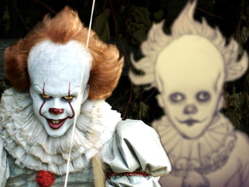
‘It’ Concept Art Proves Pennywise Was Always Terrifying
Pennywise looked creepy back in 2015.

The terrifying, child-eating entity known as “It” takes many forms, but in Stephen Kings horror novel and in the recent movie adaptation, he usually adopts the guise of Pennywise the Dancing Clown. The 2017 film offered a different, memorable spin on the clown’s look from previous iterations, making him less of a circus funnyman and more of a Victorian-era spook with hydrocephalus. It’s director, Andy Muschietti, recently revealed an early sketch of Pennywise’s look from 2015, and it’s pretty clear why it’s such an effective design.
Muschietti posted the sketch to his Instagram account on Wednesday, explaining that he drew it himself in 2015. Muschietti only signed on to direct It in July of that year, following True Detective Season 1 director Cary Fukunaga’s departure. So, Muschietti’s drawing was an early sketch indeed. It was also sketched out before Pennywise actor Bill Skarsgård joined the project.
The basics of the design are all there. What we can see of the costume looks the same, and Pennywise’s wild hair, massive forehead, and eyes that can’t seem to agree on where to look were present in the final movie design. He’s missing his fang-like red facepaint, which makes the design look more like a creepy baby than the finished product.
It’s a very different look than Tim Curry’s Pennywise in the ‘90s miniseries, which was a brighter, more straightforward clown. Skarsgård’s Pennywise also looks quite different than the clown might’ve looked in Fukunaga’s It, had it come to pass. That Pennywise, if early supposed concept art is to believe, looked like a mutant sewer monster or something out of The Thing. If there’s one complaint to be had about the final 2017 It design, it’s that it’s not exactly subtle. These earlier ideas were even less subtle.
The It sequel will hit theaters on September 6, 2019.