The Glorious Return of the Hideous One-Page Website
The early days of the Internet were actually kind of great.

One-page websites are nothing new. They’re the mudskipper of the early Internet age, the organisms that crawled out of the primordial code muck, learned to walk, then hung on as an evolutionary holdover. Today, they’re popular with app developers, design studios, artists, and minimalists in need of a billboard. And, thanks to the new platform 1 Page Party, getting them live on the Internet takes no time, only motivation.
But neither promotion nor minimalism is the point here; in fact, like so many things on the Internet, it’s not clear that there is even a point. By giving you the option to embed text, multiple YouTube videos, and repeated GIFs, it seems like the developers simply want you to go wild.
And behaving like a 13-year-old locked in a public bathroom with a Sharpie has never felt so right.
In the sample page featured on their YouTube tutorial, 1 Page Party resizes a GIF of falling rainbow smiley faces to use as a background, writes “WOAH NELLY” across the top, and embeds a Nelly music video — no wait, even better, a Nelly Furtado music video (“I’m Like a Bird”, natch), all within a matter of seconds. Hit “Publish” and the party’s ready to share with friends via its very own URL.
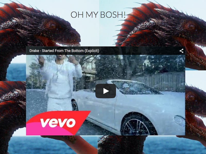
This is all a throwback to the early days of the Internet, when we filled our Geocities and Angelfire pages with scrolling text, graphic cursors, and wrote in sticky caps. The beauty of 1 Page Party is that it makes it so easy to mash up your favorite bits of the Internet — a GoT dragon GIF here, a Drake video there — and make it shareable. But, trolling your coworkers aside, is there any other use for this?
Kind of.
The disposability factor, combined with ease of use, makes one-pagers especially appealing. They can be used to share a YouTube mixtape or photos from a particular event (although you’d still have to upload them somewhere). Like a less-organized Pinterest on drugs, it can also be used to make for Internet collages; a similar product, Pegg, is being marketed as “your-mini-mobile-mood-board” and works on the same principle, although it’s less zany, more polished, and has a social component.
But the crappiness of 1 Page Party is what makes it so fun. In a way, these throwaway sites serve the same purpose as our old Geocities pages: They’re another way to more exuberantly share our personal interests. They’re not great for building your “personal brand,” but neither is getting drunk and singing Drake on the subway, which remains an excellent use of time.
All over the Internet, especially on Tumblr, there’s a trend, perhaps a backlash against stark minimalism, toward a more hypersaturated look: just take a look at Grimes’ official site or the videos of Hannah Diamond). The difference is that now, these personal pages are transient and disposable instead of permanent (thank God, otherwise we’d all end up like Mark Zuckerberg).
So, build something. The dumber the better. The Internet may be a power tool, but it’s still fun to play with.