iPhone 8 Leak Reveals the Weird New Interface Apple Has Created
Tim Cook is working on something ... different.

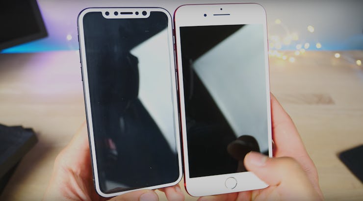
Apple can’t seem to keep much about the iPhone 8 a secret, but until now it was unclear how users would actually move around the interface. Several reports claim the device will be unveiled September 12, going on sale 10 days later, and its headline features are common knowledge. The 5.8-inch OLED screen stretches to the far sides of the device, meaning it’s a similar size to the 4.7-inch iPhone 7. This also means getting rid of the home button, though. A new report on Wednesday explained how users will navigate the iPhone 8’s interface.
The report from Bloomberg claims the version of iOS that ships with the new phone will place a bar along the bottom of the screen. Swiping up unlocks the phone. Doing the same thing again when inside an app starts the multitasking interface, which will ditch the stacked card interface in favor of individually positioned cards. Swiping up again goes back to the home screen.
Developer Steve Troughton-Smith notes that this description sounds a lot like the video found inside early iOS 11 betas.
As the phone is set to include a carved-out notch at the top of the screen, the report also states the status bar has been redesigned. The left side displays the time, while the right shows battery life, signal, and other indicators. While previous reports speculated that Apple could use the phone’s OLED technology to hide the notch at the top, using a white-on-black design to make the screen blend in, the company has reportedly opted not to do this.
Alongside this, the home screen’s dock is expected to use the same design previewed on the iPad in iOS 11 at the company’s Worldwide Developers Conference in June.
Troughton-Smith designed a mockup of how the home screen will look based on the description:
And here is how the app interface should look:
Designer Maksim Petriv has also updated his mockups to match the new description. Here is how a series of apps may look on the iPhone 8:
Whether it will work as smoothly as the old home button interface, which has allowed users to return to the home screen in an instant ever since the iPhone’s launch in 2007, remains to be seen. To make such a major change, Apple must have considered ditching the home button to be a change worth making.