How To Read the USGS Montana Earthquake Map and Not Go Crazy
It looks scarier than it really is.

The 5.8-magnitude earthquake that hit Lincoln, Montana on Thursday was the area’s strongest in 60 years. The tremors from this quake stretched for hundreds of miles across the state, and residents as far as Washington, Oregon, and parts of Canada reported shaking.
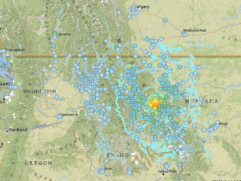
After an earthquake, the United States Geological Survey (USGS) gathers seismic data into an interactive map. These maps often look so crazy and hectic that they may blow earthquake- or volcano-related fears out of proportion, but worry not: It’s just because all the data is layered on top of each other. As the hefty online map manual explains, these data include shakes reported by the public, contour maps, past sites of earthquakes, and shake station locations all in one interactive map.
The USGS interactive map of the Montana earthquake, with all its layers shown.
As you can see above, with all of its layers the map can be intimidating. Here’s how to read the USGS map of the Montana earthquake and not go crazy.
Do You Feel It?
The USGS maps out all the shakes reported by the public in a 'Do You Feel It?' map.
One layer of the map is called a ‘Do You Feel It’ (DYFI) map, which logs information that people call in. The star above points out the epicenter of the earthquake, and the squares represent the people who reported the earthquake. The colors indicate how strong the shaking was in their area — orange represents very strong vibrations, and the cooler blues and whites signify weak shaking. It’s scary to see squares as far as Edmonton, Canada, but residents from that town reported the shaking as weak with no damages.
Shake Stations
The USGS "shake stations" are denoted by circles.
The USGS also uses “shake stations” — denoted by colored circles in the map above — to measure the magnitude of earthquakes across the country, and it process the data to make contour maps. The star, once again, represents the epicenter of the quake, and the colors in these maps are similar to the DYFI maps: Warmer colors like orange and yellow represent strong shakes, and cooler colors like blue indicate they were weak.
Contours
Data collected from shake stations help the USGS map out the contours and intensity of an earthquake.
On this “isoseismal map,” the blue contour lines denote areas where seismic intensity was reported as equal. For example, in the area denoted by the first ring around the epicenter, all of the reported shaking was equally as strong. Strength, as in the other two maps, is denoted by color: The warm hues of the contours around the epicenter show that the shaking there was most intense.
While the lines, colors and points on the Montana earthquake map look scary, the USGS reports that the 5.8-magnitude earthquake wasn’t strong enough cause structural damages to buildings. It was, however, strong enough to move heavy furniture and frighten many Montana residents — but hopefully a calm read of these maps will quell their fears.