iOS 11's Weird New Design is a Key Feature of the iPhone 8
Apple has gone all-out with bold headers.

When Tim Cook first demonstrated iOS 11 at the 2017 Worldwide Developers Conference, people were stunned. This is what Apple was working on? Gone were the iPhone’s sleek user interface headers, replaced with a bold design that looked more intended for some sort of in-car system than a stationary phone.
The bold headers, the thicker elements, the “Apple Music”-ification of the operating system all serves a purpose. Users of the public beta (don’t install it), which launched last week, may be scratching their heads as to why Apple has made these choices, but it makes more sense considered in the light of what comes next: A design that first reared its head in iOS 10’s music app can now bee seen across the operating system, just in time for the rumored iPhone 8.
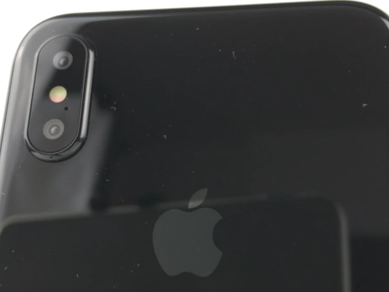
The company’s next smartphone, expected to launch this fall, is set to bring a new screen technology to the range. Gone are the LCD panels of yesteryear, replaced by a new OLED display. These advanced panels have made an appearance on numerous Android flagship smartphones over the years, and the Apple Watch has used them since its inception. These are finally expected to make their way to the iPhone 8.
The original iPhone, left, compared to the rumored iPhone 8.
The panels offer a number of benefits, like potential flexibility and the option for non-square screen shapes, but one of their most intriguing is their ability to display truly deep blacks. The screen can switch off areas at will, meaning that instead of a uniform backlit display, the screen can illuminate just the areas that show content.
The thicker headers appear at the top of lists.
In light of this, iOS 11’s design choices make a lot more sense. In a dark user interface, the bold headers would illuminate the otherwise dark panel, improving readability and creating a striking effect that makes the headers stand out more than they would otherwise.
Apple has been moving in this direction for some time. In a 2015 interview with the New Yorker, design guru Jony Ive told the publication that he liked the Apple Watch’s OLED display as it made interface elements appear as if they’re floating in space. He demonstrated this to the writer by switching on his iPhone 6.
“The whole of the display comes on,” Ive said. “That, to me, feels very, very old.”
With iOS 11 and iPhone 8, the two may catch up with Ive’s vision of a modern smartphone.
See also: This 20-Year-Old is Leaking Apple’s iPhone 8 Secrets