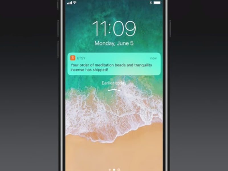
iOS 11's Notification Center Offers Clues About the iPhone 8
Shame it's confusing right now.

Apple is planning to launch iOS 11 this fall, after it likely unveils the iPhone 8, but the beta version of the coming operating system meant for developers offers a few clues as to how the iPhone 8 will function.
The release offers a number of changes, including a redesigned control center and new iPad multitasking, but a new notification center — that menu you drag down from the top of the screen — could leave many users baffled. It looks like the lock screen, it adds unnecessary information, but with rumors circulating around the company’s upcoming iPhone 8, it could prove essential.
Accessed with a swipe from the top of the screen, the notification center has been a mainstay of iOS back since version four introduced a unified notification system. It’s a simple place to find out everything you’ve missed out on and what needs your attention. Apple has made some minor changes along the way — there used to be Facebook and Twitter buttons for some reason, and recent versions have included a widget system — but the new version will radically redesign the screen by introducing something that looks a lot like the lock screen.
Here’s how it currently appears under iOS 10:
Nice and familiar.
And here’s how it now looks, under iOS 11:
What?!
To call up earlier notifications, users now swipe up from the middle of the screen. It has to be the middle: swiping from the bottom makes the whole screen disappear. Intuitive, right? Not really.
Ah! Familiarity.
Of course, this is merely a early beta version of software expected to launch in the fall, and as such it’s subject to design revision. But as it stands right now, the new design offers little benefit and actually makes navigation rather confusing by introducing a screen that looks very similar to the lock screen, the absence of a lock and the “press home to unlock” text the only indicators that this is not the lock screen.
But Apple could be playing a longer game with these changes. One of the most obvious additions is a giant clock, which on current iPhones seems superfluous as there’s a constantly-present clock on top of the screen.
The iPhone 8, rumored to launch later this year, is expected to use an OLED screen that stretches to the edges, offering 5.8 inches of diagonal screen in a phone about the same size as the 4.7-inch iPhone 7s. But that extra screen means Apple may have to cut through at the top to allow for the camera and earpiece:
If this design comes to light, it would mean ditching the clock at the top. In this case, Apple would need to find a new way to make the clock accessible. The redesigned notification center may be a confusing change at this stage, but when the next iPhone launches, it could suddenly make sense.