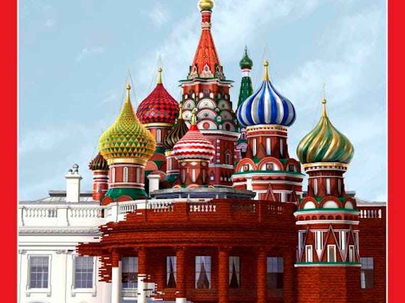
'Time' Magazine Cover Artist Explains His Russia-White House Work
The controversial cover is being hailed as timely and provocative.

On Thursday, TIME magazine released its latest cover, and it hit the internet like a bombshell: It depicts a beleaguered White House gradually being subsumed by the Russian minarets of St. Basil’s Cathedral and, in the process, transformed into a deep Soviet red. It is meant to encapsulate the ongoing Russia scandal enveloping President Donald Trump’s administration.
Accompanying the image was the TIME feature “Inside Russia’s Social Media War on America,” which focuses on Russia’s strategy of employing fake news disinformation campaigns to sway the 2016 election, as well as a 14-second GIF on the magazine’s Twitter account that shows the red corruption taking place. The cover quickly sailed to the front page of Reddit twice via the r/Design and r/pics subreddits. It was designed by Brobel Design.
Brobel’s Ed Gabel, the primary artist, tells Inverse over the phone that TIME called on Tuesday morning to request the cover.
“We had actually been working on a different cover for them … And then they called on Tuesday morning, saying they were switching to something to do with the Russia and White House political news.”
The deadline was Wednesday afternoon, giving them about 24 hours to “turn the whole thing around.”
The printed cover image
The concept for the design came directly from TIME, although the magazine had initially conceived it as showing the Russian onion dome replacing the dome of the Capitol building. As Gabel tells it:
We started down that path, and then around 5, maybe 6 o’clock Tuesday evening, they called and switched and said no they wanted it to focus more on the White House. So we switched out the concept of the Capitol for the White House building.
The golden onion domes of the Russian Orthodox Church of Mary Magdalene on the Mt. of Olives in Jerusalem, Israel.
The cover was almost immediately met with wide attention on the internet as commenters discussed both the merits of the cover design and whether or not the image should be considered culturally iconic or cynically propagandistic.
“All things considered, that’s a beautiful image. I mean what it symbolizes is horrible. But hats off to the artist,” writes one user.
“Ridiculous propaganda,” comments another. “Wow, talk about overdramatic,” said one more.
When asked if the team at Brobel had anticipated such a quick and large reaction, Gabel says that had not.
I definitely did not anticipate this kind of reaction. We were very happy with how it turned out. We got the sense from TIME that they were happy with how it turned out. But it has gotten a lot more attention than I had imagined.
And despite what fans of Trump have been saying on Reddit, Gabel says the image has by and large received a good reception.
I gotta say it’s been positive. We’ve gotten a flurry of emails, and so far everybody that has commented has been positive. I’m sure not everybody’s happy with it, but we haven’t heard from anybody who has been unhappy, so far.
For those Reddit commenters who have expressed unhappiness with the design, Gabel points them in the direction of TIME. “It was their concept, originally,” he says. “All I tried to do was execute their idea to the best that I could.”
On the r/Design subreddit, discussion about the cover has been more artistic and less political, with users doing a deep dive and searching for meaning in the smaller details. One writes:
The border between the red bricks and the White House isn’t just jagged, it has disconnected red bricks in the White House side, using bricks as pixels and data bits, communicating the nature and methods of Russia’s hacking and digital influence through swarms and torrents of data and propaganda.
It’s a good take, Gabel says, but it wasn’t quite intentional.
We did it so fast that there really wasn’t time to think things through that thoroughly. It was just really an attempt to show that the bricks were spreading, kind of taking over. If they took on the appearance of something digital, that’s coincidence.
“But it sounds like it applies,” Gabel jokes. “So I’ll take it.”
As far as his own interpretation of the final image goes, Gabel says that one word comes to mind: “provocative.” He says he hopes it grabs people, makes them notice, and read the story so they can make their own decisions.
Some have pointed out the image’s similarity to a parody of a MAD Magazine cover that was posted in December of 2016. MAD never ran it as an actual cover but created it as a goof on the newly elected president.
Gabel said he had not seen the MAD image but is a fan of the magazine: “I love MAD. I think MAD is a fun read.”
Overall, Gabel just hopes people are happy with the final product.
We try to create images that are lasting and that people will remember. This one seems to be getting a lot of attention, so I think in that sense we probably succeeded.
If nothing else, the image is timely. It comes just over one week after Trump fired FBI director James Comey, and one day after Comey’s mentor, Robert Mueller, was appointed as the special counsel for the Russia investigation.
Ed Gabel specializes in 3D graphics and animation and has also done covers for Newsweek, Rolling Stone, and ESPN The Magazine. The Russian White House isn’t Brobel’s first cover for TIME, and, Gabel says, it probably won’t be their last.