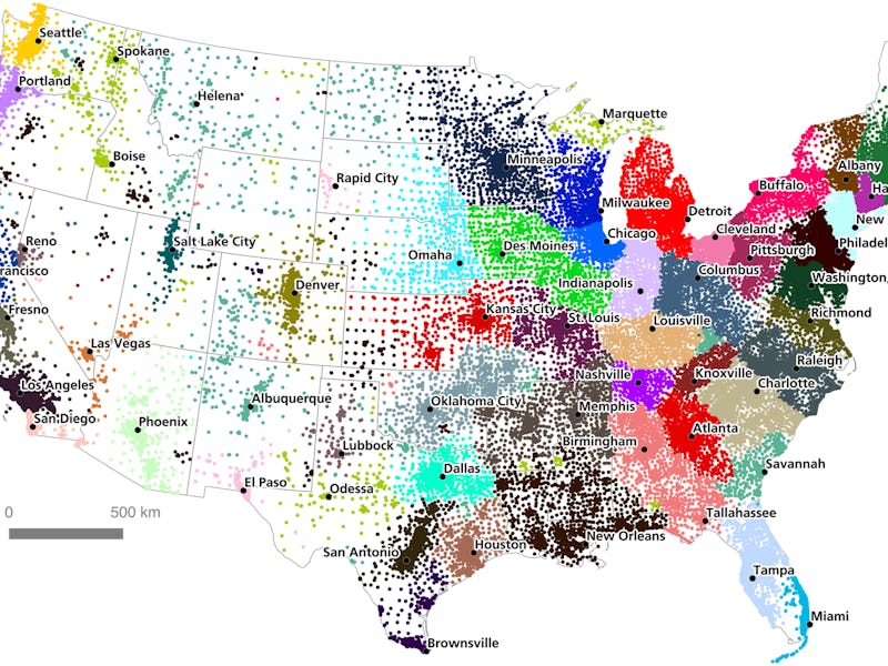
You might think you live in Washington State, but this map may suggest otherwise. A recent study by Garrett Dash Nelson and Alasdair Rae at Dartmouth College’s geography department has revealed a new series of “megaregions” based on over four million sets of commuter flow data. Sure, you could live in Washington, but if you’re commuting every day to Portland, which region are you really interacting with more?
“Such a method hints at a possibility long promised by spatial scientists: a regionalization scheme which relies entirely on spatial laws, rather than contestable human interpretation,” the paper, published in the journal PLOS, reads. Essentially, the method the paper outlines could serve as a useful model for drawing regions for all sorts of uses - electoral districts, regional government boundaries, or even cross-provincial transportation authorities could all benefit from the paper’s methods.
The team took census tracts and compared home and work places to create the map below:
Zooming in on the Bay Area as an example reveals how the team took commutes of 50 miles or less to understand how people move around:
They then divided the commutes into groups with common focal points, creating “megaregions” based on this data:
The authors note that the algorithms aren’t ideal for grouping together regions into distinguishable boundaries. Mixing the above map with a traditional method of visually drawing around cultural regions helps create a level of coherence missing from the above map, but with an end result that makes a bit more sense than traditional maps:
As you’ll probably notice, there’s a giant section of the map without a name. Commuter activity was so low in these areas that the team struggled to create megaregions that made sense from the algorithm’s data. Nonetheless, the map provides a useful starting point for reshaping the U.S. Future state boundaries, perhaps?
