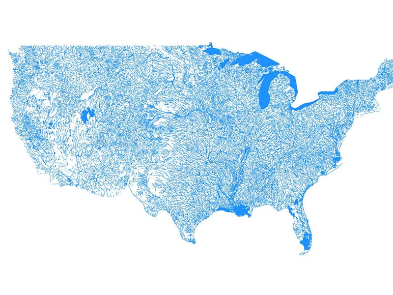
Map Shows Every Body of Water in the United States
You'll want one for your wall.

If you live in a major city, it’s likely there’s a body of water nearby thanks to our resource-savvy ancestors. But even if you think you live in a desert, a new data-driven map shows that your area might be more aqueous than it appears.
On Wednesday, Reddit user William Flamholtz uploaded a data-drive map he created of all the bodies of water in the U.S. to /dataisbeautiful. As you can see, the result is practically art.
“This map shows the streams and lakes as the so-called line features. They are not drawn to real-life scale to show better definition.” Flamholtz told Inverse on Thursday. “The lakes are drawn as polygon features, or shapes (their true shapes).”
Flamholtz says that the map also includes “dry” rivers and lakes that are not always filled with water. (This includes salt marshes, such as Salt Lake City, which can be seen as the heavy blue dot on the left side of the map). While not a real-life scale, he says the lakes are proportional to “an appropriate map of the U.S.”
Simple script that uses GIS data from the USGS to plot water bodies
In order to make the map, Flamholtz ran a Simple script that uses Geographic Information Systems (GIS) data from the United States Geological Survey to plot water bodies. The code is now up on Github for anyone looking to take a stab at creating their own map.
Of course, the map isn’t perfect. As commenters have pointed out, some regions of the map look far from accurate. Areas like the Gulf Coast, which can be considered swampy mass somewhere between land and water, proved a tricky addition to the data set. The map also doesn’t include bays, though Flamholtz intends to add them into future versions of the map.
What Flamholtz originally designed as a Christmas present for his parents is now the most up-voted post in the subreddit, even inspiring an equally beautiful knock-off map of Canada.
Canada, eh?
While Flamholtz doesn’t have any intentions to commodify the map, it would definitely make a great holiday gift for the geology nerd in your life.