Check Out These 6 Dope FCC Maps
Bet you never expected "dope" and "FCC" to be in the same headline.

The FCC deals with a lot of complicated issues that affect millions of people.
It helps figure out where broadband internet is available, how much of the United States has access to high-speed cellular networks, and the number of pirate radio operators it’s taken down over the last couple months. That’s all fascinating — who doesn’t want to know where good internet connections might be found? — but having to read through the agency’s detailed reports isn’t exactly thrilling.
The FCC knows this is a problem. “We have a data model that looks at broadband availability down to the census track level. If you’ve ever looked at a spreadsheet of census tracks, you know how unusable that information is,” says Mark Wigfield, the deputy director of the FCC’s office of media relations. “But if you put that data on a map and graphically depict it suddenly it becomes very clear to people.”
So the agency decided to create these fascinating maps whenever a new report or commission order is released.
Here are six of the coolest maps the FCC has published over the last couple of years:
This map showing where 4G wireless is available
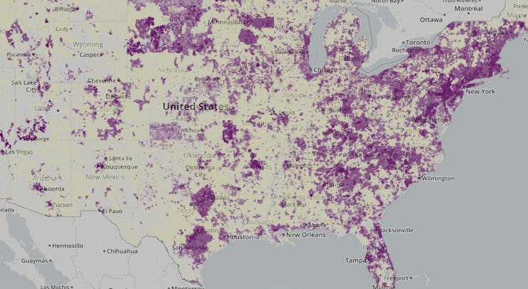
It sometimes feels like high-speed wireless internet isn’t available when you need it. But according to the FCC’s map showing just how much of the nation was covered with 4G connectivity in 2015, most of us have it pretty good. The agency even does the kindness of breaking out exactly what kind of “4G” — WiMAX, HSPA Plus, LTE — is available if you care about how your phone is connecting to the rest of the world.
This map showing how many decent broadband providers are in an area
Most internet providers have effective monopolies or duopolies in their markets. Sometimes you get to choose between Comcast and Time Warner Cable, for instance, and other times you get to choose between Comcast and not connecting to the internet at all. (Or, worse, having to pay a ridiculous sum for dial-up.) The FCC’s map shows the best and worst places for people who like a little competition.
This map showing how broadband internet access is delivered
While most of us view the internet as an inscrutable bundle of tubes or cell towers dedicated to letting us stream Netflix, the networks are actually a jumble of technologies that work in different ways. Here the FCC explains where each is used to expose the systems that enable our connections.
This map showing internet connectivity options throughout the country
I don’t know about you, but decent internet access is something I take into account whenever I move somewhere new. (Gotta have the best connection for those Jessica Jones catch-up sessions.) This FCC map allows you to look up specific places to see what you might be able to expect if you were to live there.
This map showing how internet connectivity and health intersect
Can your internet connection affect your health? The FCC map above is meant to help figure that out by comparing download speeds, access to health data, obesity, and other metrics to see how much better off you might be if you had a better internet connection. (Assuming, of course, that connection isn’t used to stream Netflix all day.)
This map showing where the FCC took down pirate radio operators
Yeah, I saved the best for last. I didn’t even realize that pirate radio stations were still a thing, or that they could put people in danger by interfering with public safety frequencies, but apparently the FCC still has to crack down on them in 2016. The map shows where pirate radio stations are most popular and how the FCC punishes their operators with various “enforcement actions.”
Want more? Good news
The FCC said in July that it was redesigning its maps site and committing to publishing maps on a more regular basis. The section is apparently one of the more popular pages on the FCC website. “To keep pace with the demand for more and improved data visualization tools,” the agency said, “we’ve been working to update our maps site to streamline the publishing process and increase the public’s access to the maps published by the Commission.”
The maps serve another useful function: Making it so the FCC doesn’t have to walk people through its more in-depth reports. “That’s useful for the public, useful for us, useful for other units of government,” Wigfield says. “We get calls all the time from people working for various states asking where we’re funding broadband deployment. Some of this information is very readily usable.”