Where the Hell Did My Instagram Go? Here's the Photo-Sharing App's New Look
Instagram just got a splash of color.

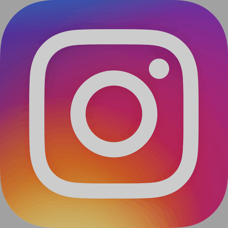
When you woke up this morning, you may have been shocked to find that the familiar camera-shaped Instagram logo had suddenly disappeared. Fear not! All that’s happened is that the company has suddenly decided to ditch the old logo that actually looked like a camera and replace it with some sort of gradient that kind of looks like a camera if you squint.
It’s not the only thing that’s changed. The app itself has ditched the simple shades of color for an even simpler black and white design. Photos stand out more when flicking through the newsfeed with this monochromatic layout, as bursts of color whizz by with every scroll.
“We wanted to create a look that would represent the community’s full range of expression — past, present, and future,” said Ian Spalter, Instagram’s head of design, in a post on Medium.
So, how did the logo change without permission? Chances are you have automatic updates enabled. Apps on iPhones running iOS 7 and newer will update themselves when the phone is connected to wifi. This, for the most part, is a good thing, as it keeps apps fresh with the latest features and security patches. Automatic updates are enabled by default under “iTunes & App Stores” in the “Settings” app.
The complete range of new apps.
Instagram isn’t the only big name that got a refresh this week. Google Search began testing a new monochrome look, painting the blue links in the query results on its website a rather fetching shade of black.
The whole headline-grabbing redesign has come at an interesting time. Facebook, who owns Instagram, has been under the spotlight after Gizmodo reported on Monday that Facebook employees routinely suppressed conservative news from appearing in the site’s trending section. The revelations have led the U.S. Senate Commerce Committee to launch an inquiry into Facebook’s practices.