7 Horror Movie Posters That Reference Authentic Artistic Movements
Warhol, Disney, and Picasso are just a few influences on the best of modern horror advertisements.

Horror movie posters have always incorporated the following: blood, sex, and creepy children. It’s implicit in visual media that horror ads tend to be on the lowbrow end of the spectrum, satisfying our most carnal curiosities.
They shouldn’t be, and as the following posters attest, they aren’t. Instead, these posters were chosen not just for their artistic contributions to the medium of film posters, but because these 7 posters recall specific artistic traditions to subtly go in-depth on the nature of their films.
1. The Witch
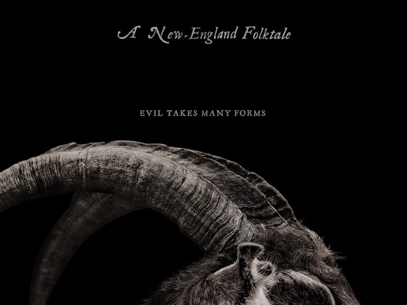
The Witch
Maybe the most fantastic ad campaign for any horror film in recent memory, The Witch billed itself as “A New England Folklore”. Among the posters featuring photo-realistic goats, crows and other satanic imagery is this poster by Midnight Marauder.
The design features a naturalist painting of a farmer girl and a goat which echoes the early 18th century American paintings. Early American paintings preferred simple subject matters in natural or romantic settings, as these were the desired subject matters of the time. What really drives the poster home however is the added phrase “Evil Takes Many Forms”, creating a sinister unease about the otherwise innocent painting.
2. Bone Tomahawk
Just like the old movie posters for classic Hollywood westerns, Bone Tomahawk decided to follow a similar route, showcasing Kurt Russell off in traditional, grizzled fashion. Playing Sheriff Franklin Hunt, Russell led this surprisingly effective horror-western right under our skin.
The singular and effective use of a blood orange shows off the poster’s classic sensibilities, and looks like it could just as easily be the cover of a pulp novel. Maybe even featuring Clint Eastwood in his heyday. You would probably even be forgiven if you didn’t know this was also a horror film, at least until that guy gets ripped in half while screaming.
3. A Girl Walks Home Alone at Night
A Girl Walk Home Alone at Night
What better artist to reference than Pablo Picasso for a film that’s such a mashup of cultures and genre as A Girl Walks Home Alone at Night? The “Iranian vampire western” is a stylish, critically acclaimed movie that has all the hallmarks of classic French cinema, but the intense moral/political drama of modern Iranian films. By using utilizing a surreal, European art style to depict a haunting visage wrapped a traditional chador, the artist evokes the multi-cultural influences within expressionist art in the western tradition.
4. It Follows
It Follows
It Follows is such a perfect modern remix of an old school horror film, referencing John Carpenter seems like a no-brainer. The film’s anachronistic style that makes it seem like the movie takes place in alternate future where the 70s never ended, and the movie Halloween probably took place the next town over makes this John Carpenter style movie poster especially appropriate.
5. You’re Next
You're Next
You’re Next is a fantastic home invasion thriller with the lunacy of a coke fueled drug trip. Perfect then, to use someone like Andy Warhol whose pop-art sensibilities were divisive enough in the art world to be labeled as unintelligent and consumerist.
You’re Next director Adam Wingard would probably take those as compliments as his film is especially gleeful in its gore and violence. The film’s poster shows the same pop-art irreverence towards its classic horror movie premise.
6. Escape from Tomorrow
Escape from Tomorrow
Escape from Tomorrow is a fantasy horror film shot completely within the actual Disneyland and Walt Disney World locations, without the actual knowledge of the Walt Disney Company. As such, the film’s release seemed unlikely for a time as Disney is notoriously protective of its image.
Luckily the film which tells the story of a father’s nightmarish last day with his family at the happiest place on Earth avoided any legal action from the company. In fact, the film’s poster was even brazen enough to utilize the famous hand of a certain mascot mouse as well as the recognizable font and lettering of the company.
7. Crimson Peak
Crimson Peak
Like a Jane Austen novel, only directed by the man behind Pan’s Labyrinth and Pacific Rim, Crimson Peak is a fantastic visual feast of Gothic imagery and English melodrama. The poster, made specially for the film by Mondo, appropriately uses an artistic style that is reminiscent of the same woodblock illustrations found in only the dustiest of leather-bound romance novels.
It’s comforting to know that this poster would be at ease in both a cinema, and a library.