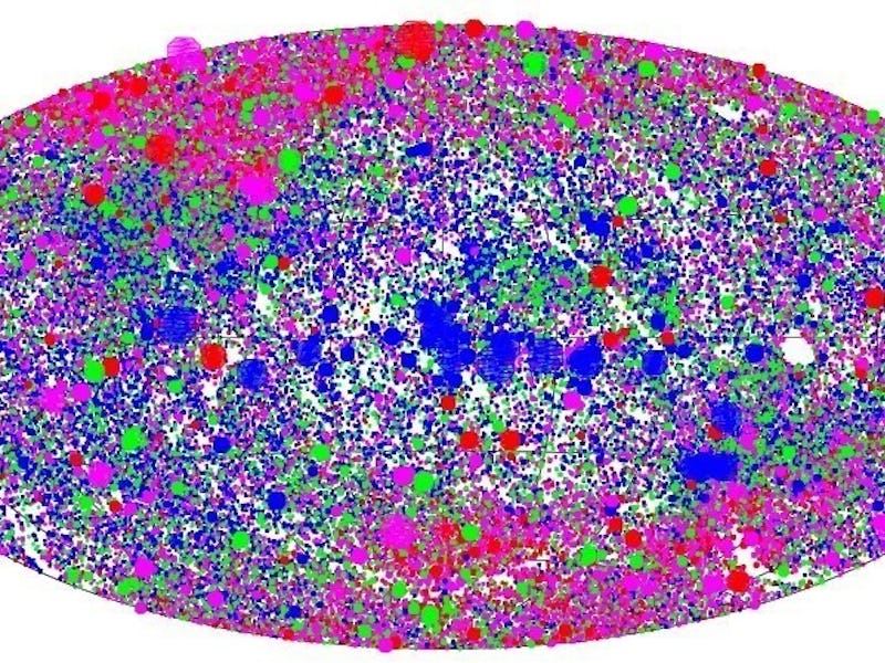
Scientists Have Created an X-Ray Map ... of the Sky
Looks hella strange and hella awesome.

X-rays aren’t just invisible beams that dentists shoot at you to determine the level of your teeth’s gnarliness. The rays also buzz throughout the universe, unseen by human eyes. But we can visualize them now, thanks to scientists who did us a solid and created an x-ray map of the sky.
Though we can’t see it, a lot of physical activity happens across different wavelengths of the electromagnetic spectrum. In the night sky, x-rays zip around as a result of strange cosmic phenomena. Finding out from where these rays blast off helps us to understand more about the powerful events in the universe — the ones that dictate the life and death of stars, the formation of planetary systems, and the emission of energy across long distances.
To make this map, scientists at the Max Planck Institute for Extraterrestrial Physics used data from the now-defunct ROSAT satellite — a tool hanging around in orbit that’s capable of surveying the entire sky — and cataloged the collective distribution of x-rays in the sky into one map.
You’re probably looking at the map and feeling totally lost, so here’s the skinny: each dot you see represents the x-ray source that was measured by ROSAT. The size represents the brightness of the ray, while the color represents the actual wavelength of the signal on the electromagnetic spectrum. The brightest dots are indicative of very powerful celestial events, like accreting black holes, giant galaxy cultures, and supernovas.
ROSAT was shut down back in 1999, after an eight-year run. The satellite burned up in reentry in 2011. The data it collected lives on, finding purpose among a new generation of astronomers and scientists. This map will soon be enhanced by whatever scientists can compile from the eROSITA x-ray survey telescope the Max Planck Institute plans to launch in 2017. But for now, let yourself get lost in this great big mess of color: